Daily High and Low Temperatures

Daily global temperature extremes have been changing over the last few decades. The figure from the IPCC’s latest report shows the shift in both the daily minimum (nighttime) and maximum (daytime) temperatures. The blue dotted line in the figure represents the period between 1951-1980, and the red dotted line represents the period between 1981-2010. The upper graph shows an increase in the daily minimum temperatures of 2°C (3.6°F), and the lower graph shows an increase in the daily maximum temperatures of 1°C (1.8°F).
The blue shaded areas represent the coldest temperatures and the red shaded areas, the warmest temperatures. In both figures, the number of the coldest days and nights has decreased as shown by the darker blue shading. The number of the warmest days and nights has increased as shown by the darker red shading.
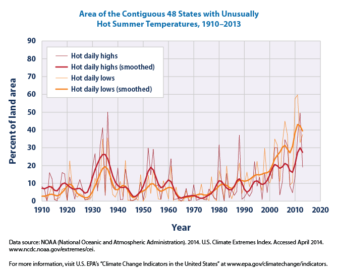
In the U.S., we see trends that are comparable to the global data. This figure of NOAA temperature data from a recent Environmental Protection Agency report shows unusually hot highs and hot lows for the summer months between 1910 and 2013. This graph is based on maximum daily temperatures (typically occurring during the day) and minimum daily temperatures (typically occurring at night). The recorded highs and lows at each station are compared to the full set of historical records. After averaging over the summer months (June-August), the warmest 10 percent of years are considered “unusually hot.” The lighter lines represent the individual years, and the bolded smooth red and orange lines represent a 9-year weighted average. The red lines refer to the hot daily highs and the orange lines refer to the hot daily lows. You should observe that, other than the period in the 1930s, hot daily lows and highs have been steadily increasing over the last few decades. We’ll discuss the 1930s in the upcoming investigation on drought.
Projections for the hottest and coldest days show dramatic changes as we approach the end of the 21st century. Again, the amount of warming and changes to the climate system depend on the emissions path that we choose. The figure below shows the projected temperature change of hottest and coldest days for the low and high scenarios (RCP 2.6 and RCP 8.5). The figure shows the changes in temperature for 2081-2100 relative to 1986-2005. If we rapidly reduce and discontinue fossil fuel emissions before the end of the century, the projected hottest and coldest days would be slightly warmer than today. (See first column in figure for both RCP 2.6 scenarios.) However, if we continue with the “business as usual” scenario (RCP 8.5), we will see much warmer temperatures by the end of the century with both the hottest and coldest days becoming even warmer.
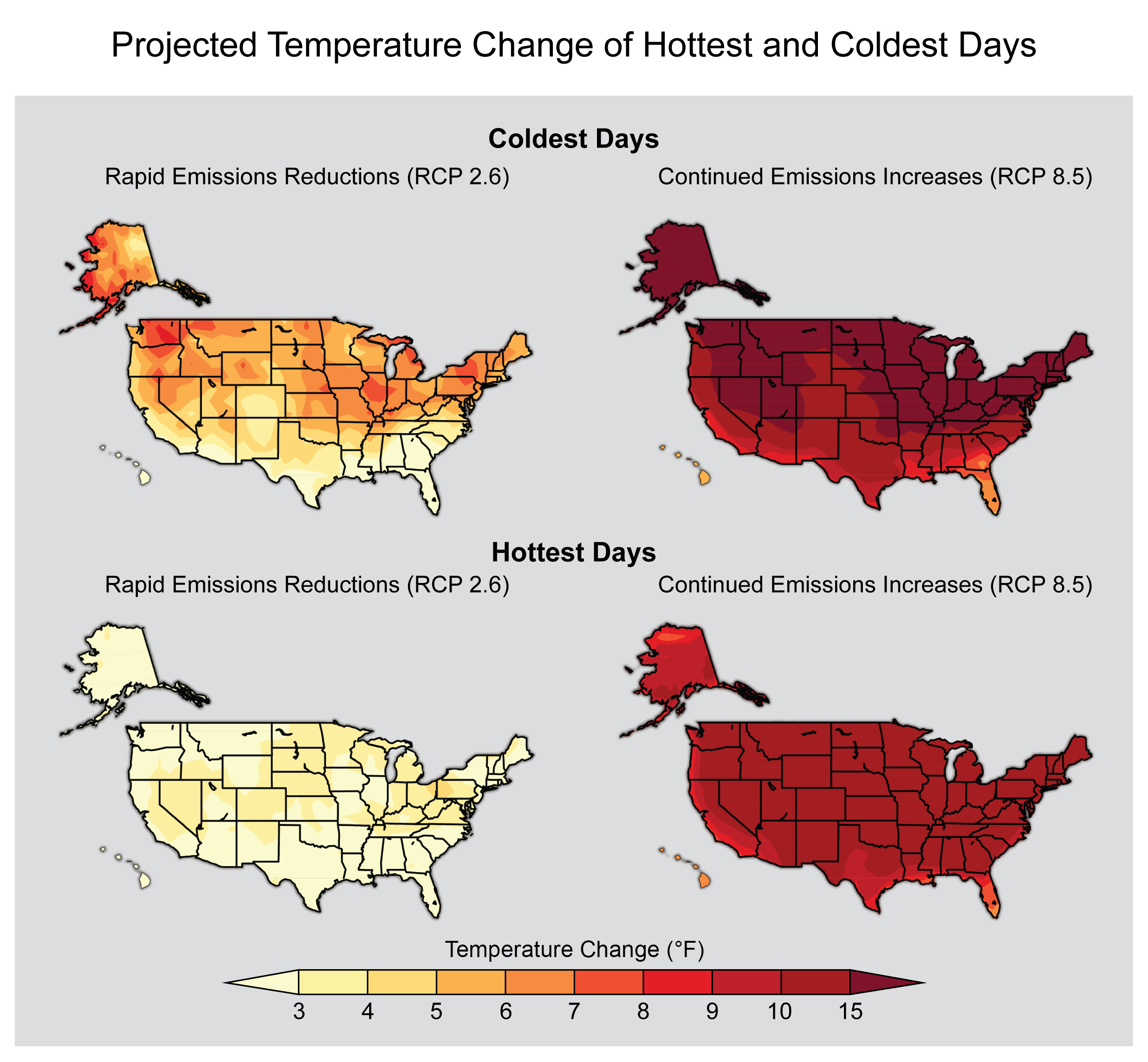
Projected Temperature Change of Hottest and Coldest Days (1986 – 2005 to 2081 – 2100). Image Source: NCA
Heat Waves
A heat wave is generally a period of several days to weeks of abnormally hot weather that may or may not be accompanied by high humidity. The World Meteorological Organization defines a heat wave as five or more consecutive days of temperatures 5°C (9°F) above the average maximum temperature.
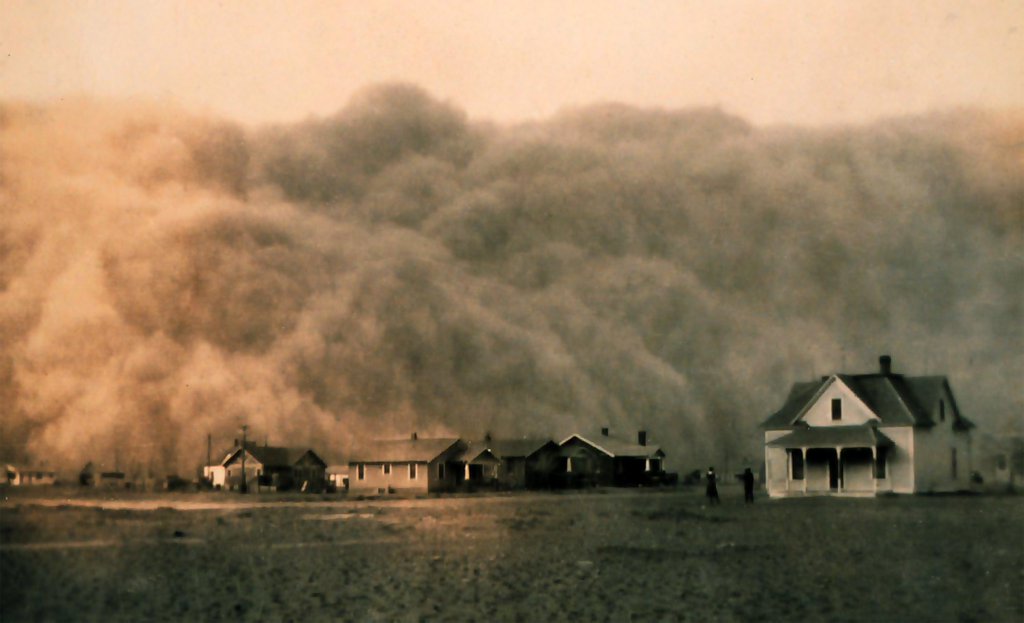
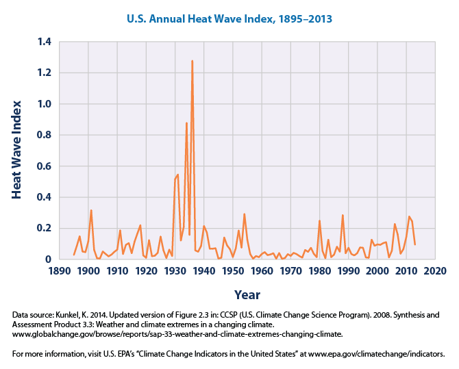
In the 1930s, the U.S. experienced the worst heat wave ever recorded. This period is illustrated clearly by the figure below. During this time, areas in the mid-west were farmed so intensely that the soil moisture was depleted. With new plow-based farming machinery available to farmers, vast areas of the mid-west were cleared and farmed. Throughout the late 1920s, crop yields increased. But as the U. S. entered the Great Depression of the 1930s, the demand for these crops decreased leaving many plowed fields were unplanted in subsequent planting seasons. Unfortunately, the heat waves coincided with a drought, drying out the bare topsoil. The lack of soil moisture reduced the moderating (cooling) effects of evaporation and contributed to more heat waves. As a result of the drying, exposed soils and dust storms (also called Black Blizzards) were a common occurrence by 1935. The region became known as the Dust Bowl. A recent study suggests that the dust contributed to the atmospheric variability at the time, intensifying and spreading the drought across about 70% of western North America.
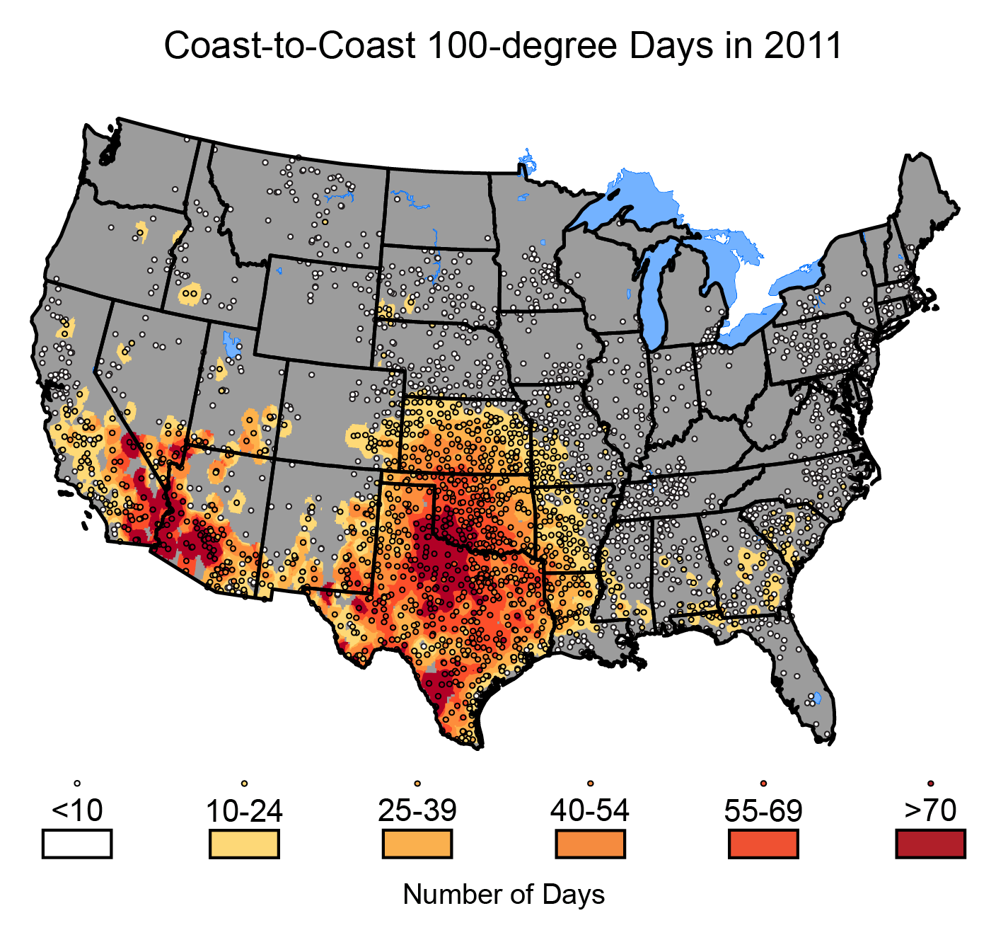
With an increasing number of hotter days, there have been a greater number of heat waves. The figure below shows the days in 2011 that were over 100°F. It is clear that Texas suffered more severely than almost any other part of the U.S. According to the U. S. Energy Information Administration, the entire state set record temperatures throughout the month of August. Dallas recorded temperatures of 100°F or greater on 59 of the 62 days over the months of July and August, and on August 2nd and 3rd, temperatures were 110°F.